Readable and Interactive graph for multiple correspondence analysis
Source:R/mca-data.R, R/plot-render.R
ggmca.RdA readable, complete and beautiful graph for multiple
correspondence analysis made with multiple_correspondence_analysis.
ggfacto is the same graph, for any analysis.
Interactive tooltips, appearing when hovering near points with mouse,
allow to keep in mind many important data (tables of active variables,
and additional chosen variables) while reading the graph.
Profiles of answers (from the graph of "individuals") are drawn in the back,
and can be coloured by the clusters of hierarchical_clust.
Since it is made in the spirit of ggplot2, it is possible to
change theme or add another plot elements with +. Then, interactive
tooltips won't appear until you pass the result through ggi.
Step-by-step functions : use ggmca_data to get the data frames with every
parameter in a MCA printing, then modify, and pass to ggmca_plot
to draw the graph.
Usage
ggmca(
  res.mca,
  data,
  sup_vars,
  active_tables = "active",
  tooltip_vars_1lv,
  tooltip_vars,
  axes = c(1, 2),
  axes_names = NULL,
  axes_reverse = NULL,
  type = c("text", "labels", "points", "active_vars_only", "facets"),
  color_groups = "^.{0}",
  clust_color_groups = "^.+$",
  keep_levels,
  discard_levels,
  cleannames = TRUE,
  profiles = TRUE,
  profiles_tooltip_discard = "^Pas |^Non |^Not |^No ",
  clust,
  max_profiles = 2000,
  alpha_profiles = 0.7,
  color_profiles = TRUE,
  base_profiles_color = "#bbbbbb",
  text_repel = TRUE,
  title,
  actives_in_bold = NULL,
  sup_in_italic = TRUE,
  ellipses = NULL,
  xlim,
  ylim,
  out_lims_move = FALSE,
  shift_colors = 0,
  colornames_recode,
  scale_color_light = material_colors_light(),
  scale_color_dark = material_colors_dark(),
  text_size = 3.5,
  size_scale_max = NULL,
  dist_labels = c("auto", 0.04),
  right_margin = 0,
  use_theme = TRUE,
  get_data = FALSE,
  lang = NULL,
  dat,
  cah,
  cah_color_groups
)

ggmca_data(
  res.mca,
  data,
  sup_vars,
  active_tables = "active",
  tooltip_vars_1lv,
  tooltip_vars,
  color_groups = "^.{0}",
  clust_color_groups = "^.+$",
  keep_levels,
  discard_levels,
  cleannames = TRUE,
  profiles = TRUE,
  profiles_tooltip_discard = "^Pas |^Non |^Not |^No ",
  clust,
  max_profiles = 2000,
  lang = NULL,
  dat,
  cah,
  cah_color_groups
)

ggmca_plot(
  plot_data,
  axes = c(1, 2),
  axes_names = NULL,
  axes_reverse = NULL,
  type = c("text", "points", "labels", "active_vars_only", "facets"),
  text_repel = TRUE,
  title,
  ellipses = NULL,
  actives_in_bold = NULL,
  sup_in_italic = TRUE,
  xlim,
  ylim,
  out_lims_move = FALSE,
  color_profiles = TRUE,
  base_profiles_color = "#bbbbbb",
  alpha_profiles = 0.7,
  shift_colors = 0,
  colornames_recode,
  scale_color_light = material_colors_light(),
  scale_color_dark = material_colors_dark(),
  text_size = 3.5,
  size_scale_max = NULL,
  dist_labels = c("auto", 0.04),
  right_margin = 0,
  use_theme = TRUE,
  get_data = FALSE,
  data
)
Arguments
- res.mca
An object created with
multiple_correspondence_analysisorFactoMineR::MCA.- data
The data frame the analysis was made on, in which to find the supplementary variables and the clusters: the whole data frame, even when the analysis was made on a subset of it with
multiple_correspondence_analysis. Only needed with `sup_vars`, `clust` or the tooltip variables.- sup_vars
<tidy-select> The supplementary variables to draw, as in `tab()`: `sup_vars = c(SEXE, AGE)` (strings work too). They need not be given to the analysis before.
- active_tables
The coloured crosstabs shown in the tooltips. `"active"`, the default, crosses each active variable with the others: it is the Burt table the analysis was computed from, so a level at the edge of the cloud shows many colours and one near the centre few. `"sup"` crosses each supplementary variable with the active ones, `c("active", "sup")` does both, and `NULL` none. Percentages are coloured blue when over-represented and red when under-represented, as in
tabxplor::tab(color = "diff").- tooltip_vars_1lv
<tidy-select> Variables whose first level (a factor), or weighted mean (a number), is added at the top of the tooltips.
- tooltip_vars
<tidy-select> Variables whose levels are all added at the bottom of the tooltips.
- axes
The axes to print, as a numeric vector of length 2.
- axes_names
Names of all the axes (not just the two selected ones), as a character vector.
- axes_reverse
Possibility to reserve the coordinates of the axes by providing a numeric vector : `1` to invert left and right ; `2` to invert up and down ; `1:2` to invert both.
- type
Determines the way
sup_varsare printed."text": colored text"points": colored points with text legends"labels": colored labels"active_vars_only": the active levels alone, and the answer profiles"facets": one graph of profiles of answer for each levels of the firstsup_vars(`profiles = TRUE` is not needed). A different color is used for each.
- color_groups
By default, there is one color group for all the levels of each `sup_vars`. It is possible to color `sup_vars` with groups created upon their levels, with a regex matched against each level name (the groups are printed in the console with `options(ggfacto.verbose = TRUE)`). For exemple, `color_groups = "^."` makes the groups upon the first character of each levels (uselful when their begin by numbers).
color_groups = "^.{3}"upon the first three characters.color_groups = "NB.+$"takes anything between the `"NB"` and the end of levels names, etc.- clust_color_groups
Color groups for the `clust` variable (the clusters).
- keep_levels
A regex, or a vector of them, matching the supplementary levels to keep: the others are discarded.
- discard_levels
A regex, or a vector of them, matching the supplementary levels to discard.
- cleannames
Set to
TRUEto clean levels names, by removing prefix numbers like"1-", and text in parentheses.- profiles
By default, the answer profiles are drawn in the back of the graph, as light-grey points whose tooltips give their answers to the active variables. With
clust, each profile takes the colour of its cluster, and to hover near one point lights all the points of its cluster. `FALSE` draws the levels alone.- profiles_tooltip_discard
A regex pattern to remove useless levels among interactive tooltips for profiles of answers (ex. : levels expressing "no" answers).
- clust
The variable of `data` holding the clusters, typically made with
hierarchical_clust, as a bare name (`clust = cah_culture`) or a string. The clusters are drawn as a supplementary variable, and the answer profiles of one cluster are coloured alike and linked at mouse hover (unless `profiles = FALSE`).- max_profiles
The maximum number of profiles points to print, the heaviest first. Default to 2000.
- alpha_profiles
The alpha (transparency, between 0 and 1) for profiles of answer.
- color_profiles
By default, if
clustis provided, profiles are colored based on clust levels (HCPC clusters). Set doFALSEto avoid this behaviour. You can also give a character vector with only some of the levels of the `clust` variable .- base_profiles_color
The base color for answers profiles. Default to gray. Set to `NULL` to discard profiles. With `color_profiles`, set to `NULL` to discard the non-colored profiles.
- text_repel
By default, labels are moved so that they do not overlap, with
ggrepel::geom_text_repel. Set toFALSEto print each label exactly at its point, which is faster to draw.- title
The title of the graph.
- actives_in_bold
Set to `TRUE` to set active variables in bold font (and sup variables in plain).
- sup_in_italic
Set the supplementary levels in italics, as in every graph of the package. `FALSE` sets them upright.
- ellipses
Set to a number between 0 and 1 to draw a concentration ellipse for each level of the first
sup_vars.0.95draw ellipses containing 95 individuals of each category.0.5draw median-ellipses, containing half the individuals of each category. Every individual counts, whether or not `profiles = TRUE`.- xlim, ylim
Horizontal and vertical axes limits, as double vectors of length 2.
- out_lims_move
When
TRUE, the levels out ofxlimorylimare not removed, but moved to the edges of the graph.- shift_colors
Change colors of the
sup_varspoints.- colornames_recode
A named character vector with
fct_recodestyle to rename the colour groups. They are printed in the console with `options(ggfacto.verbose = TRUE)`.- scale_color_light
A scale color for sup vars points
- scale_color_dark
A scale color for sup vars texts
- text_size
Size of text.
- size_scale_max
The size of the largest point. By default, computed from the spread of the weights of the points drawn, so that the median answer profile stays visible.
- dist_labels
When
type = points, the distance of labels from points.- right_margin
A margin at the right, in cm. Useful to read tooltips over points placed at the right of the graph without formatting problems.
- use_theme
By default, a specific
ggplot2theme is used. Set toFALSEto customize your owntheme.- get_data
Returns the data frame to create the plot instead of the plot itself.
- lang
NULL(the session's language),"en"or"fr": the language of the tooltips and of the axis titles.- dat
Deprecated former name of `data`. Still accepted, with a warning; use `data` instead.
- cah, cah_color_groups
Deprecated former names of `clust` and `clust_color_groups`.
- plot_data
A list of data frames made with ggmca_data.
Value
A ggplot object to be printed in the
`RStudio` Plots pane. Possibility to add other gg objects with +.
Sending the result through ggi will draw the
interactive graph in the Viewer pane using girafe.
A list to pass to ggmca_plot: `vars_data` (one row per level), `ind_data` (one row per answer profile, with `profiles = TRUE`), `individuals` (one row per individual, with `sup_vars`), `res`, `clust` and `lang`.
A ggplot object.
Functions
ggmca_data(): get the data frames with all parameters to print a MCA graphggmca_plot(): draws a plot model — the oneggmca_data()returns, and the one the correspondence and principal component graphs build internally.
Examples
# \donttest{
data(tea, package = "FactoMineR")
res.mca <- multiple_correspondence_analysis(tea, 1:18)
# Interactive graph for multiple correspondence analysis :
ggmca(res.mca, tea, sup_vars = SPC, ylim = c(NA, 1.2)) |>
ggi() # to make the graph interactive
# Hover a level: its crosstabs with every other active variable, the Burt table the analysis
# was computed from. Points near the middle show few colours, points at the edges plenty.
ggmca(res.mca, ylim = c(NA, 1.2)) |>
ggi()
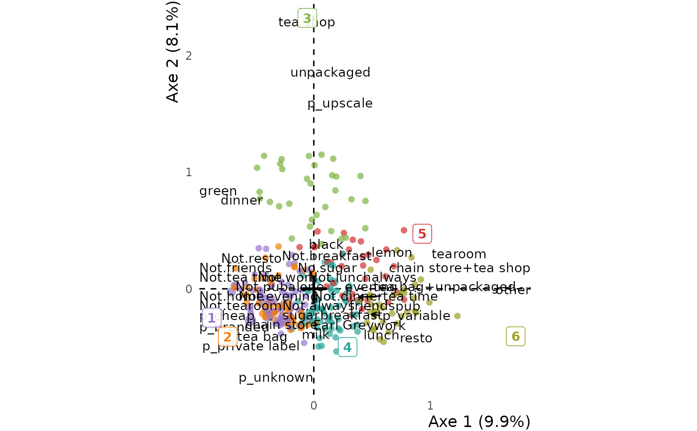
# Graph with colored clusters (hierarchical clustering on the first three axes)
tea <- tea |>
dplyr::mutate(clust = hierarchical_clust(res.mca, ncp = 3, nb_clust = 6))
ggmca(res.mca, tea, clust = clust)
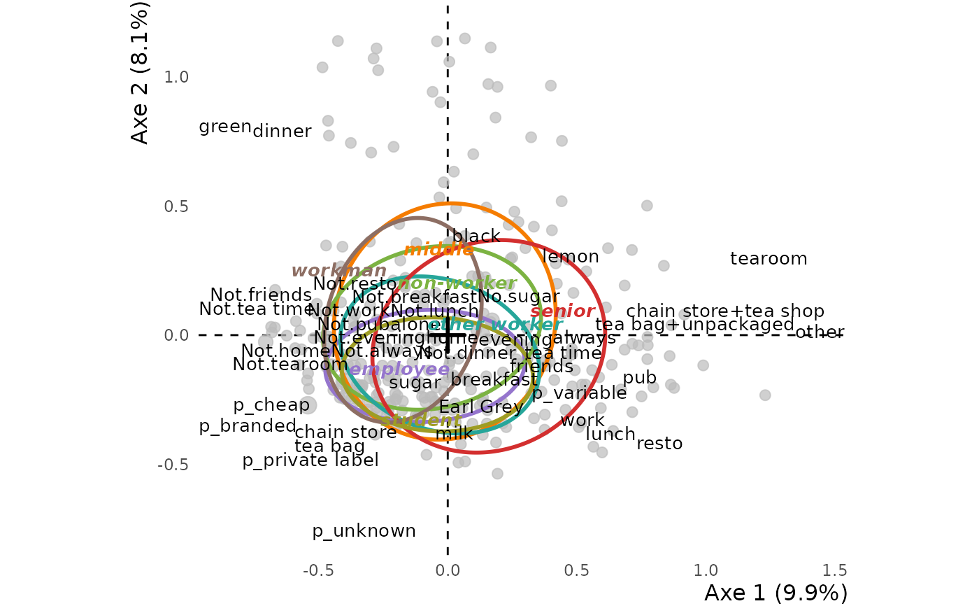
 # Concentration ellipses for each levels of a supplementary variable :
ggmca(res.mca, tea, sup_vars = SPC, ylim = c(NA, 1.2),
ellipses = 0.5, profiles = TRUE)
# Concentration ellipses for each levels of a supplementary variable :
ggmca(res.mca, tea, sup_vars = SPC, ylim = c(NA, 1.2),
ellipses = 0.5, profiles = TRUE)
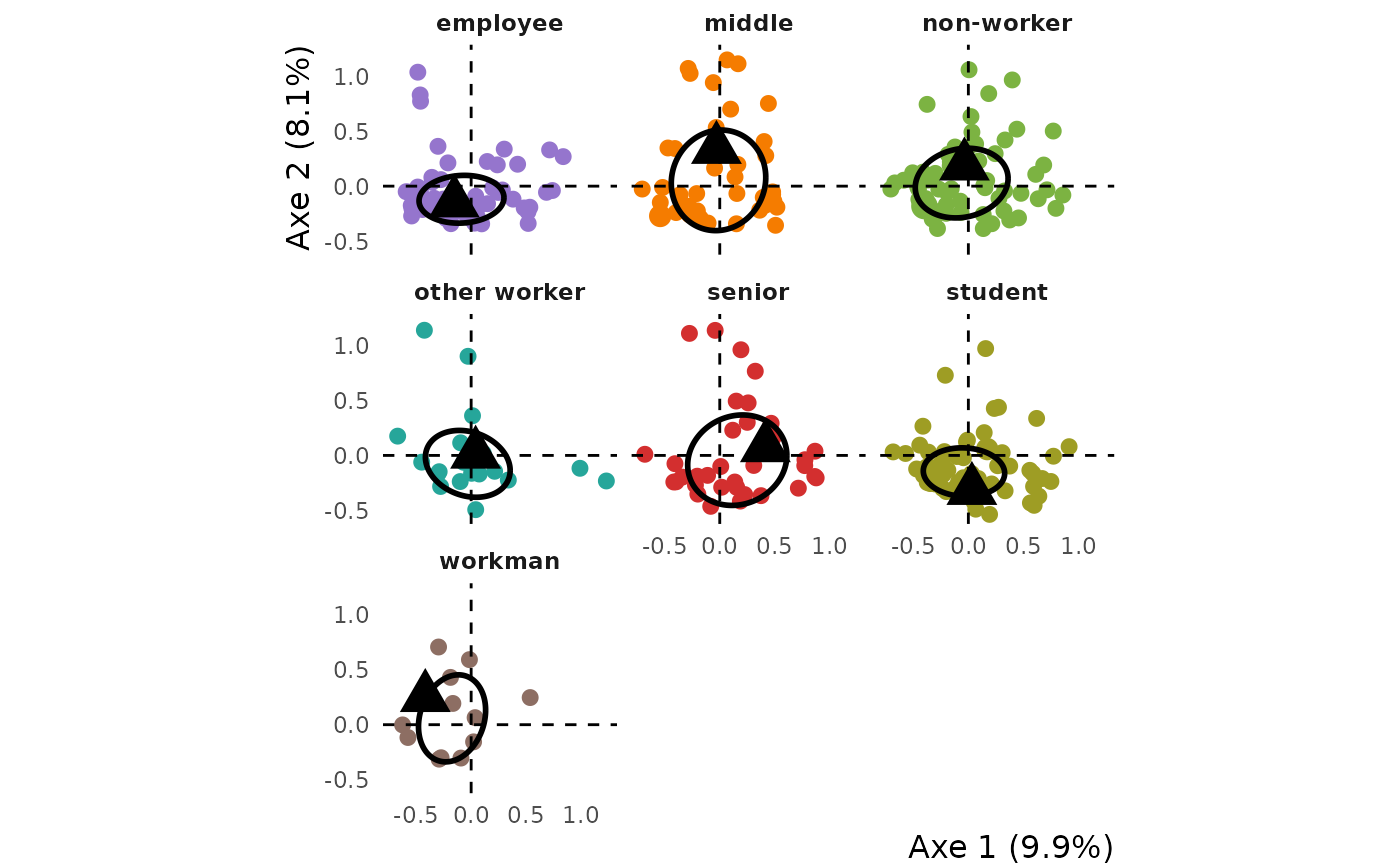
 # Graph of profiles of answer for each levels of a supplementary variable :
ggmca(res.mca, tea, sup_vars = SPC, ylim = c(NA, 1.2),
type = "facets", ellipses = 0.5, profiles = TRUE)
# Graph of profiles of answer for each levels of a supplementary variable :
ggmca(res.mca, tea, sup_vars = SPC, ylim = c(NA, 1.2),
type = "facets", ellipses = 0.5, profiles = TRUE)
 # }
# }