Introduction to ggfacto: PCA, CA and MCA, close to the data
Source:vignettes/articles/ggfacto.Rmd
ggfacto.RmdCe guide existe aussi en français : Introduction à ggfacto.
ggfacto draws the geometric data analyses of
FactoMineR so that they can be read without losing
sight of the data. Hover over a point of the interactive graph,
and it shows the crosstables it comes from, each percentage coloured by
its deviation from the mean: blue where a category is over-represented,
red where it is under-represented. A category at the edge of the cloud
then reads as the sum of its deviations, which is the best guard against
over-interpreting the geometry.
The three methods share one workflow:
- the analysis, with the data frame first, as in
tabxplor::tab(); -
interpret(), the table of the axes, with the eigenvalues underneath; -
ggfacto(), the graph, made interactive byinteractive = TRUE; - the clusters, added to the data frame with
mutate()and described byclust_tab().
One option decides how every table prints, tabxplor’s
and ggfacto’s alike: with
options(tabxplor.print = "html"), they print as html tables
in RStudio, Positron or a document.
Principal component analysis: means
A PCA summarises numeric variables. Here, the cars of
mtcars are described by six active measurements, and the
number of cylinders is a supplementary variable.
cars <- mtcars |> mutate(cyl = factor(cyl))

pca <- principal_component_analysis(cars, c(mpg, disp, hp, drat, wt, qsec))
interpret(pca)| Variables | Axe 1 | Axe 2 | Axe 3 | |||||||||
|---|---|---|---|---|---|---|---|---|---|---|---|---|
| variable | mean | sd | sd/mean | coord | contrib | cos2 | coord | contrib | cos2 | coord | contrib | cos2 |
| <mean> | <sd> | <cv> | <mean> | <col%> | <row%> | <mean> | <col%> | <row%> | <mean> | <col%> | <row%> | |
| mpg | 20.09 | 5.93 | 30% | -0.94 | 21% | 88% | -0.06 | 0% | 0% | -0.11 | 4% | 1% |
| disp | 230.72 | 121.99 | 53% | 0.95 | 22% | 91% | 0.06 | 0% | 0% | 0.06 | 1% | 0% |
| hp | 146.69 | 67.48 | 46% | 0.87 | 18% | 76% | -0.39 | 13% | 15% | 0.08 | 2% | 1% |
| drat | 3.60 | 0.53 | 15% | -0.75 | 13% | 56% | -0.47 | 19% | 22% | 0.46 | 64% | 21% |
| wt | 3.22 | 0.96 | 30% | 0.90 | 19% | 81% | 0.32 | 9% | 10% | 0.24 | 17% | 6% |
| qsec | 17.85 | 1.76 | 10% | -0.52 | 6% | 27% | 0.82 | 58% | 67% | 0.20 | 12% | 4% |
| Total | 100% | 100% | 100% | |||||||||
|
Coordinate on the axis, i.e. its correlation with it: a variable above,
by +0.1; +0.2; +0.4; +0.8 SD; a variable below, by -0.1; -0.2; -0.4; -0.8 SD.
contrib: its contribution to the variance of the axis; an axis sums to 100 % cos2: quality of representation sd/mean: coefficient of variation – the standard deviation as a percentage of the mean, comparable between variables measured in different units |
||||||||||||
| Variance | |||
|---|---|---|---|
| Axe | eigenvalue | % variance | cumul. |
| <var> | <col%> | ||
| Axe 1 | 4.187 | 69.8% | 69.8% |
| Axe 2 | 1.148 | 19.1% | 88.9% |
| Axe 3 | 0.333 | 5.6% | 94.5% |
| Axe 4 | 0.154 | 2.6% | 97.1% |
| Axe 5 | 0.125 | 2.1% | 99.1% |
| Axe 6 | 0.052 | 0.9% | 100% |
| Total | 6.000 | 100% | |
The table opens on the variables as they were before
the analysis: mean, standard deviation and coefficient of
variation (sd/mean, the standard deviation as a
percentage of the mean, which can be compared across variables measured
in different units). Then comes each axis: the coordinate of each
variable (its correlation with the axis, coloured), its contribution and
its quality of representation (cos2). The first axis, 70 % of the
variance, sets displacement, horsepower and weight against fuel economy
(mpg): a size effect. The second singles out the cars that
are slow off the mark (qsec).
ggfacto(pca, cars, sup_vars = cyl, interactive = TRUE)The biplot draws the cars (in grey), the active variables (the
arrows), and the supplementary categories at the centre of gravity of
their cars. Hover: an arrow gives its variable’s mean
and coefficient of variation; a supplementary category gives the mean of
every active variable within it, coloured by its deviation from the
overall mean; a car gives its own values.
ggfacto(pca, profiles = FALSE) draws the correlation circle
alone.
Correspondence analysis: a crosstable
A CA is the analysis of one crosstable, so it is
computed on the table itself. Here, religion is crossed with party
identification in the US General Social Survey sample of
forcats::gss_cat, non-responses left out.
gss <- forcats::gss_cat |>
  filter(!relig %in% c("No answer", "Don't know", "Not applicable"),
         !partyid %in% c("No answer", "Don't know"))

tab(gss, relig, partyid, pct = "row", color = "contrib")| partyid | |||||||||
|---|---|---|---|---|---|---|---|---|---|
| relig | Other party |
Strong republican |
Not str republican |
Ind,near rep | Independent | Ind,near dem |
Not str democrat |
Strong democrat | Total |
| <row%> | <row% (n)> | ||||||||
| Inter-nondenominational | 1% | 13% | 9% | 8% | 26% | 12% | 10% | 20% | 100% ( 108) |
| Native american | 0% | 0% | 4% | 4% | 26% | 17% | 30% | 17% | 100% ( 23) |
| Christian | 3% | 8% | 15% | 10% | 22% | 9% | 18% | 14% | 100% ( 684) |
| Orthodox-christian | 0% | 10% | 12% | 11% | 18% | 15% | 20% | 15% | 100% ( 94) |
| Moslem/islam | 1% | 2% | 3% | 7% | 21% | 19% | 28% | 18% | 100% ( 99) |
| Other eastern | 0% | 6% | 6% | 9% | 38% | 22% | 9% | 9% | 100% ( 32) |
| Hinduism | 0% | 0% | 9% | 3% | 38% | 17% | 26% | 7% | 100% ( 69) |
| Buddhism | 4% | 6% | 3% | 5% | 21% | 27% | 20% | 13% | 100% ( 143) |
| Other | 7% | 3% | 7% | 12% | 22% | 21% | 14% | 15% | 100% ( 221) |
| None | 3% | 3% | 8% | 8% | 28% | 18% | 16% | 16% | 100% ( 3 509) |
| Jewish | 2% | 6% | 10% | 4% | 10% | 14% | 21% | 32% | 100% ( 388) |
| Catholic | 1% | 9% | 14% | 9% | 21% | 11% | 21% | 14% | 100% ( 5 090) |
| Protestant | 1% | 15% | 17% | 8% | 16% | 10% | 16% | 17% | 100% (10 794) |
| Total | 2% | 11% | 14% | 8% | 19% | 12% | 17% | 16% | 100% (21 254) |
| pvalue (Chi2 !) | <0.01% | ||||||||
| Cramér’s V | 0.10 | ||||||||
|
Contribution to Chi2: cell over-represented vs independence, by ×1; ×2; ×5; ×10 the mean contribution; cell
under-represented, by ×1; ×2; ×5; ×10 the mean contribution.
|
|||||||||
With color = "contrib", a cell is coloured by its
contribution to the table’s variance, which is what
weighs in the analysis: blue when it is over-represented, red when
under-represented.
ca <- correspondence_analysis(tab(gss, relig, partyid))
interpret(ca)| Variable | Positive_levels | Negative_levels | |||
|---|---|---|---|---|---|
| <col%> | <col%> | ||||
|
Axe 1: 76.2% of variance |
relig | None | 55.0% | Protestant | 32.4% |
| relig: above mean ctr | 55.0% | 32.4% | |||
| partyid | Independent | 21.1% | Strong republican | 35.9% | |
| Ind,near dem | 18.3% | Not str republican | 18.0% | ||
| partyid: above mean ctr | 39.4% | 53.9% | |||
|
Axe 2: 10.9% of variance |
relig | Jewish | 43.0% | Catholic | 34.3% |
| relig: above mean ctr | 43.0% | 34.3% | |||
| partyid | Strong democrat | 46.4% | Independent | 17.2% | |
| Other party | 14.3% | ||||
| partyid: above mean ctr | 60.8% | 17.2% | |||
|
Contribution to the variance of the axis: a level on the positive side,
contributing ×1; ×2; ×5; ×10 the mean contribution; a level on
the negative side, contributing ×1; ×2; ×5; ×10 the mean contribution.
|
|||||
| Axe | eigenvalue | % variance | cumul. |
|---|---|---|---|
| <var> | <col%> | ||
| Axe 1 | 0.049 | 76.2% | 76.2% |
| Axe 2 | 0.007 | 10.9% | 87.1% |
| Axe 3 | 0.005 | 7.5% | 94.6% |
| Axe 4 | 0.002 | 2.7% | 97.3% |
| Axe 5 | 0.001 | 2.0% | 99.4% |
| Axe 6 | 0 | 0.5% | 99.9% |
| Axe 7 | 0 | 0.1% | 100% |
| Total | 0.064 | 100% |
On each axis, interpret() keeps only the categories that
contribute more than average, facing each other by the sign of their
coordinate. The first axis, 76 % of the variance, opposes Republican
Protestants to the non-religious, who lean towards independents and
Democrats; the second sets Jewish respondents and strong Democrats apart
from Catholics. Once interpreted, the axes are named, and the names are
printed on the graphs and in the tables.
ca <- name_axes(ca, "Republican Protestants / no religion",
                    "Catholics / Jewish Democrats")
ggfacto(ca, interactive = TRUE)
Hover over a category to see its profile: its row of the crosstable, each percentage coloured by its deviation from the mean. The CA shows the structure of the table’s deviations, and says nothing of their size: that is what the coloured table beside it is for.
Multiple correspondence analysis: response patterns and the Burt table
An MCA analyses several questions at once. The tea
survey of FactoMineR asked 300 people 18 active questions
about how they drink tea.
data(tea, package = "FactoMineR")

mca <- multiple_correspondence_analysis(tea, 1:18)
interpret(mca, axes = 1:2)| Question | contrib | Positive_levels | Negative_levels | |||
|---|---|---|---|---|---|---|
| <col%> | <col%> | <col%> | ||||
| Axe 1: 9.9% of variance (mod. 55%) | where | 15.7% | chain store+tea shop | 11.3% | chain store | 4.4% |
| tearoom | 13.9% | tearoom | 11.2% | Not.tearoom | 2.7% | |
| how | 11.2% | tea bag+unpackaged | 6.8% | tea bag | 4.3% | |
| friends | 9.1% | friends | 3.2% | Not.friends | 6.0% | |
| resto | 8.5% | resto | 6.3% | Not.resto | 2.2% | |
| price | 8.1% | p_variable | 3.5% | p_branded | 3.0% | |
| tea.time | 7.2% | tea time | 3.1% | Not.tea time | 4.1% | |
| pub | 5.5% | pub | 4.4% | |||
| work | 4.2% | work | 3.0% | |||
| How | 3.9% | other | 2.3% | |||
| Tea | 3.4% | green | 3.0% | |||
| lunch | 2.8% | lunch | 2.4% | |||
| Above mean ctr | 87.0% | 57.3% | 29.6% | |||
|
Axe 2: 8.1% of variance (mod. 28%) |
where | 28.6% | tea shop | 23.9% | chain store | 4.6% |
| price | 25.6% | p_upscale | 20.5% | p_branded | 2.5% | |
| how | 23.4% | unpackaged | 18.9% | tea bag | 4.5% | |
| Tea | 7.3% | green | 3.3% | Earl Grey | 2.4% | |
| Above mean ctr | 80.5% | 66.6% | 13.9% | |||
|
Contribution to the variance of the axis: a level on the positive side,
contributing ×1; ×2; ×5; ×10 the mean contribution; a level on
the negative side, contributing ×1; ×2; ×5; ×10 the mean
contribution.
contrib: the whole question’s contribution to the axis |
||||||
| Axe | eigenvalue | % variance | cumul. |
Benzecri’s modified rate |
cumul. mod. |
|---|---|---|---|---|---|
| <var> | <col%> | <col%> | |||
| Axe 1 | 0.148 | 9.9% | 9.9% | 55.4% | 55.4% |
| Axe 2 | 0.122 | 8.1% | 18.0% | 28.1% | 83.4% |
| Axe 3 | 0.090 | 6.0% | 24.0% | 7.6% | 91.1% |
| Axe 4 | 0.078 | 5.2% | 29.2% | 3.3% | 94.3% |
| Axe 5 | 0.074 | 4.9% | 34.1% | 2.1% | 96.5% |
| Axe 6 | 0.071 | 4.8% | 38.9% | 1.6% | 98.1% |
| Axe 7 | 0.068 | 4.5% | 43.4% | 1.0% | 99.1% |
| Axe 8 | 0.065 | 4.4% | 47.7% | 0.6% | 99.7% |
| … of 27 | … | … | … | … | … |
| Total | 1.500 | 100% | 100% |
In an MCA the raw rates of variance are low by construction, so the number of axes to interpret is chosen on Benzécri’s modified rates, in the eigenvalue table: 83 % for the first two axes here. The first axis opposes tea drunk only at home to tea drunk out, with friends — in tearooms, restaurants and pubs; the second, supermarket tea bags to loose tea from specialist shops.
mca <- name_axes(mca, "at home / out, with friends",
                      "supermarket / tea shop")
ggfacto(mca, tea, sup_vars = c(sex, SPC), interactive = TRUE)
The data frame is passed again, second, for the supplementary variables (in italics). Hover, and two things can be read:
- the grey points are the response patterns: the people who gave exactly the same answers, sized by their number. Each one lists its answers;
- each category shows its crosstables with every other active question. Together they form the Burt table the MCA is computed from, its deviations from the mean coloured. The data is back in view, without crossing the 18 questions two by two.
Clustering
Hierarchical clustering groups together the individuals closest to
one another on the first axes. Without nb_clust, it draws
the tree and cuts it where the gain in between-cluster variance
drops.
hierarchical_clust(mca, ncp = 3)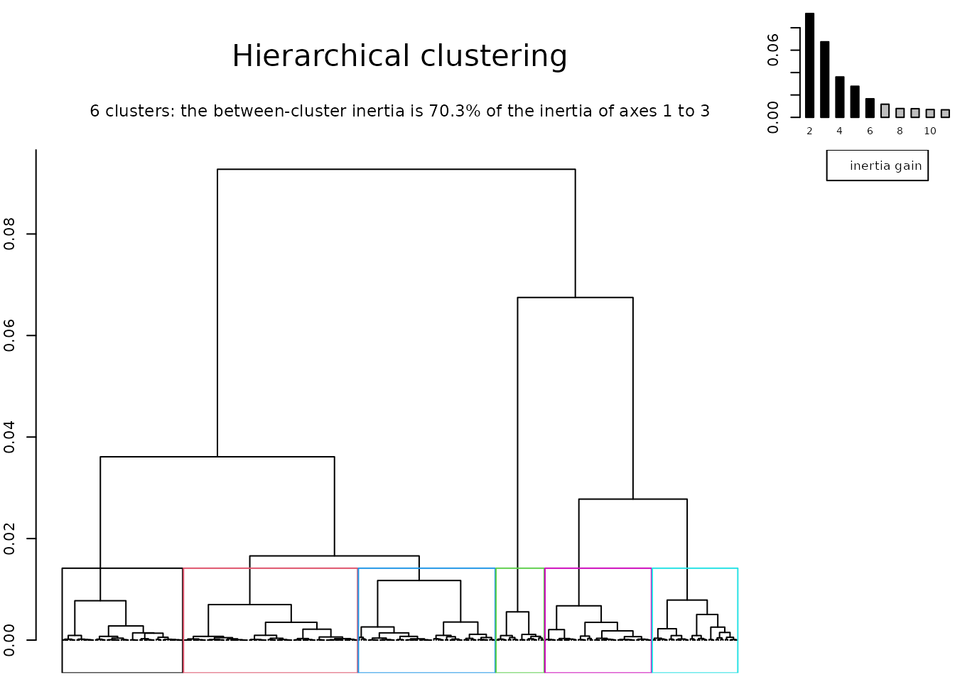
The clusters are added to the data frame with mutate(),
named in the order of your choice ("name" = number): the
tree is not built again.
tea <- tea |>
  mutate(clusters = hierarchical_clust(mca, ncp = 3, names = c(
    "Supermarket tea bags"   = 1,
    "Sweet Earl Grey"        = 2,
    "Earl Grey with friends" = 4,
    "Black, no sugar"        = 5,
    "Tea-shop connoisseurs"  = 3,
    "Tea everywhere"         = 6
  )))

clust_tab(mca, tea, clusters)| clust | |||||||
|---|---|---|---|---|---|---|---|
| lvs |
Supermarket tea bags |
Sweet Earl Grey |
Earl Grey with friends |
Black, no sugar |
Tea-shop connoisseurs |
Tea everywhere | Ensemble |
| <col%> | <col%> | ||||||
| breakfast | 65% | 12% | 44% | 61% | 44% | 67% | 48% |
| Not.tea time | 49% | 79% | 34% | 15% | 50% | 14% | 44% |
| evening | 10% | 50% | 41% | 30% | 31% | 58% | 34% |
| lunch | 6% | 9% | 23% | 6% | 9% | 39% | 15% |
| dinner | 4% | 11% | 6% | 3% | 22% | 0% | 7% |
| always | 13% | 39% | 39% | 27% | 44% | 64% | 34% |
| home | 100% | 86% | 100% | 100% | 97% | 100% | 97% |
| Not.work | 81% | 88% | 59% | 73% | 78% | 36% | 71% |
| Not.tearoom | 97% | 98% | 89% | 45% | 75% | 39% | 81% |
| friends | 30% | 68% | 86% | 76% | 56% | 100% | 65% |
| Not.resto | 90% | 80% | 66% | 67% | 91% | 33% | 74% |
| Not.pub | 97% | 84% | 70% | 82% | 78% | 44% | 79% |
| black | 39% | 2% | 6% | 73% | 25% | 17% | 25% |
| Earl Grey | 44% | 84% | 92% | 24% | 47% | 81% | 64% |
| green | 16% | 14% | 2% | 3% | 28% | 3% | 11% |
| alone | 61% | 88% | 67% | 52% | 69% | 44% | 65% |
| lemon | 4% | 9% | 9% | 6% | 19% | 31% | 11% |
| milk | 35% | 4% | 20% | 24% | 12% | 22% | 21% |
| other | 0% | 0% | 3% | 18% | 0% | 3% | 3% |
| No.sugar | 63% | 18% | 50% | 85% | 56% | 47% | 52% |
| tea bag | 84% | 82% | 64% | 24% | 9% | 17% | 57% |
| tea bag+unpackaged | 15% | 12% | 31% | 61% | 19% | 81% | 31% |
| unpackaged | 1% | 5% | 5% | 15% | 72% | 3% | 12% |
| chain store | 95% | 96% | 67% | 33% | 6% | 19% | 64% |
| chain store+tea shop | 5% | 0% | 31% | 67% | 9% | 81% | 26% |
| tea shop | 0% | 4% | 2% | 0% | 84% | 0% | 10% |
| p_branded | 49% | 50% | 27% | 9% | 6% | 17% | 32% |
| p_cheap | 4% | 5% | 2% | 0% | 0% | 0% | 2% |
| p_private label | 15% | 11% | 2% | 3% | 0% | 3% | 7% |
| p_unknown | 5% | 7% | 5% | 0% | 0% | 3% | 4% |
| p_upscale | 5% | 5% | 3% | 45% | 81% | 8% | 18% |
| p_variable | 22% | 21% | 62% | 42% | 12% | 69% | 37% |
| % of population | 26% | 19% | 21% | 11% | 11% | 12% | 100% |
| n | 79 | 56 | 64 | 33 | 32 | 36 | 300 |
|
Percentage points (risk) difference: cell ≥ the Total column +5; +10; +20; +30 points; cell ≤ the Total column
-5; -10; -20; -30 points.
|
|||||||
The table describes each cluster by the active variables, weighted as in the analysis, with the deviations from the whole population coloured. The graph places the clusters in the cloud, with their individuals in their colour:
ggfacto(mca, tea, clust = clusters)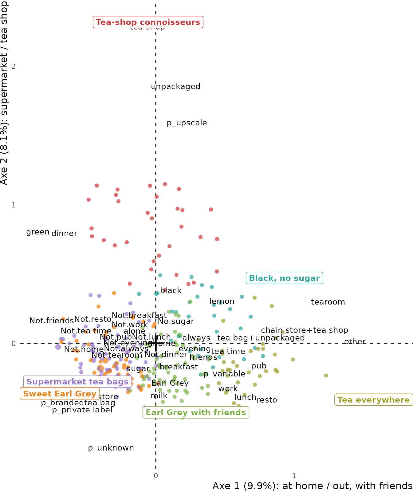
Going further
-
Survey weights:
wt =in all three analyses. The weights carry through to the crosstables in the tooltips. -
Specific MCA:
excl =leaves categories out of the analysis (missing values, by default). Subpopulation:filter =, orfilter()in the pipe, then the whole data frame passed toggfacto(). -
Graphs: they are
ggplotobjects, which you can extend with+beforeggi().ggsave2()saves them, andggmca_3d()andggpca_3d()draw them in three dimensions. - The coordinates of the individuals are added to the data frame with
mutate(axis1 = axis_coord(mca, 1)), just like the clusters.
The reference documents every function.