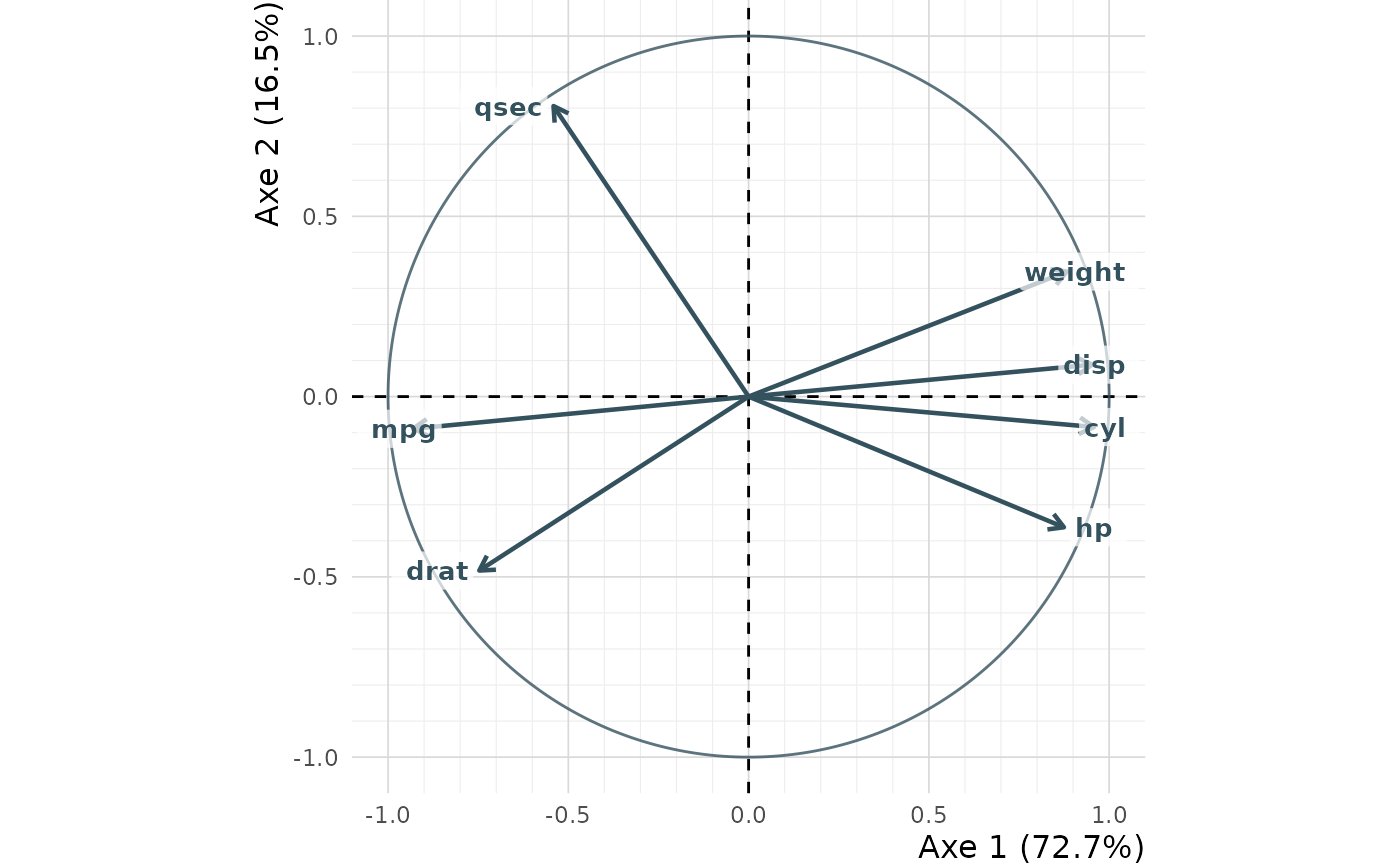
The active variables of a principal component analysis as arrows in the circle of
correlations: the coordinate of a variable on an axis is its correlation with it. Hovering a
variable shows its coordinates, and its projections on the two axes. ggfacto draws
it for a principal component analysis with `profiles = FALSE` and nothing else asked for; by
default, it draws the same arrows over the cloud of individuals.
Usage
ggpca_cor_circle(
  res.pca,
  axes = c(1, 2),
  proj = FALSE,
  interactive = FALSE,
  text_size = 3.5,
  lang = NULL,
  axes_names = NULL,
  axes_reverse = NULL,
  title,
  xlim,
  ylim
)
Arguments
- res.pca
An analysis made with
principal_component_analysisorFactoMineR::PCA.- axes
The axes to print, as a numeric vector of length 2.
- proj
Set to `TRUE` to print projections of vectors over the two axes.
- interactive
Set to `TRUE` to get the interactive graph at once, as
ggiwould make it. By default, aggplot, to which elements can be added with `+` before passing it toggi.- text_size
Size of the text.
- lang
NULL(the session's language),"en"or"fr".- axes_names
Names of all the axes, as a character vector.
- axes_reverse
`1` to invert left and right, `2` to invert up and down, `1:2` for both.
- title
The title of the graph.
- xlim, ylim
Horizontal and vertical limits, as numeric vectors of length 2.
Value
A ggplot, or an html widget with `interactive = TRUE`.
Examples
data(mtcars, package = "datasets")
mtcars <- mtcars[1:7] |> dplyr::rename(weight = wt)
res.pca <- principal_component_analysis(mtcars, 1:7)
ggpca_cor_circle(res.pca)
 ggpca_cor_circle(res.pca) |> ggi() # interactive